Monday 20 May 2019

Magazine practical task evaluation

1.


2.
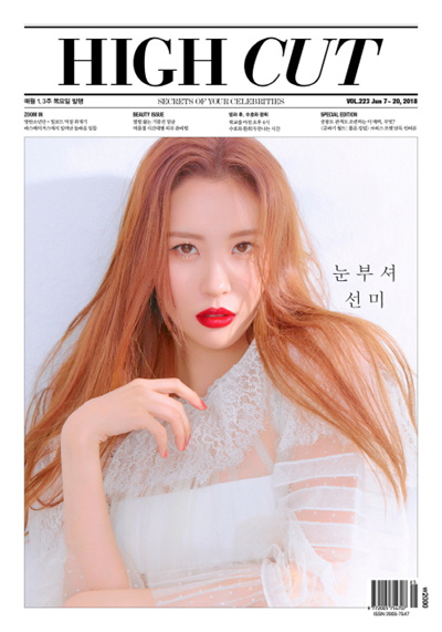
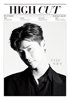
I think that I got down most of the key conventions to the High Cut magazines. The font was similar but not 100% the same and the overall layout of the magazine seemed to match. I think that one problem with this magazine is that the background on the main image is too dark so if I lightened the background a bit it would have made it seem closer to the references.

3.
Related imageImage result for high cut magazine korea

4.
The layout of the title, sub headings and image. The placements of the following match to a certain extent. The colour scheme was close because of the black and white aspect to it and the different shades of blacks and greys for the writing matched. For example, the 'secrets of you celebrities' is written in a light shade of grey in the original magazine so I copied that into my own magazine to try and get the small details the same.

5.
The actual size of the image and title and sub headings. The layout out was right but the size was different. The title was too wide and big compared to the original and the sub headings had the same problem. I needed to start the actual magazine lower and the picture ended the background to stretch out to the sides of the paper. This wasn't done making it seem much more impacted compared tot he original that filled the whole front.

6.
Next time, I would attempt to change the font for the title to something that is the same as the actual magazine. Perhaps use the title as a picture put it on the magazine. The sub headings would be smaller and I would fit in 4 instead of 3. The font would be smaller which would make the magazines seem identical. Lastly, the image would have an extended background that went all the way to the edge of the magazine cover. The background of the image would also be lightened up a bit so that it follows other black and white covers from High Cut where the backgrounds are extremely light greys. Another thing I could do is to try and do it in colour like some of the other High Cut magazine covers.

Sunday 19 May 2019

Magazine practical task planning

1.
The high cut magazine does not have this aspect to their magazine. Perhaps a way to differentiate their magazine from key conventions.

2.
The main image I will be using is a close up of a female model in black and white because I saw that the magazine lacks black and white versions of female cover images. Since the magazine was originally Korean, fashion wise would also mirror current trending outfits in Korea. Perhaps an oversized striped shirt on top of a white T- shirt. Hairstyle wise, my model will be Aman so a fringe (which also goes with the Korea feel as fringes are seen more often there) along with maybe a wavy 2a or 2b on the rest of the hair at the back and side. Lighting wise, light focused on one side of the face to create a shadow on the other side. This method has been used on several other black and white covers.

3.
To go along with the simplistic overall look, I plan to make the sub headings very simple so short and catchy will be my aim. 'Be free' 'be you' 'be yourself' etc.

4.

Magazine Practical task research

1.
Related image Related imageRelated image
Vogue/ Ceci/ High Cut

2.
I choose High Cut because of its simplistic look with a very structured look. The minimalistic style looks very clean and the centre image pulls the focus of the magazine cover so what the main image is will determine the overall feel and attraction to the magazine. With this is mid, I can move on to think about the stance, clothing choice and hairstyle of my model in order to make it as impactful as I can.

3.
Related imageRelated imageImage result for high cut magazine korea
Title - The title is the second biggest aspect in the magazine cover after the main image. The font is bold and big in order to catch audience eyes and the word 'cut' is slightly slanted to make it a bit more unique than it already is.

Main image - After a few looks at the different covers of the magazine, I found that there was a split between some of the images being coloured and some of them being in black and white. On the black and white covers, there is always some sort of shadow either on the background or on the models face. On the coloured covers, the shadows are less obvious and the focus is more on the model, expression, hair ad outfit.

Strapline - There are a number of sub stories under the main title but all are written in Korean for this magazine so I am not sure what it says but most likely the headline for different stories that are inside the magazine.

Design - The overall design of the magazine is simplistic, minimalistic and clean. It doesn't look like many other well known magazines like the Vogue or Elle and the way there is no overlap between the main image and tag lines is what makes this magazine unique.


Advertising assessment: Learner response

1.
Some strong ideas but you written expression let you down at times and confuses what you mean. More theory would pull this up.

2.
Q1 - Black tie as a phallic object (Mulvey) - being grabbed by female model

Q2 - In the score hair cream advert, the representation of gender reinforces Judith Butlers idea of gender as performance - dominant/ submissive gender roles clearly reinforced in construction of advert

Q3 - Include Lynx ad how they have repositioned its advertising campaigns away from sexiest, objectified representation of women to more of a male empowerment message

3.
5/10

4.
The brand logo used with a serif font, links to the monochrome colour scheme, style, sophistication and tradition.

5.
Needed to add in actual events like the Equal Pay Act in 1970.

6.
In todays society, times are changing and businesses are in search for employees with 'soft' skills such as emotional intelligence and communication which are traditionally associated with women. Whether this traditional viewing was right or wrong, it shows that times have changed and what you to be seen as a 'masculine' job have typically become automated. With businesses looking for different skill sets, this could be the opening to the argument that masculinity is in crisis.


Wednesday 15 May 2019

Advertising index

Advertising: Introduction - narrative in advertising

Advertising: persuasive techniques

Advertising: the representation of women in advertising

Advertising: Score case study and wider reading

Advertising: Maybelline case study and wider reading

Advertising: Gauntlett - Media, Gender and Identity reading and questions

Guantlett: Gender, Identity and advertising

1.
Gauntlett says that the traditional views of women as house wives or low status workers have been kick boxed out of the picture. The Score hair cream advert reinforces this traditional view thus putting the male in the dominant position, however, in the Maybelline advert, we see a much equal representation of the 2 genders where both Manny and Shayla subvert stereotypes.

2.
We as audiences no longer strive for the traditional views therefor going for a change where we want to experiment with our lives. The media allows us to do this by allowing us to find so many different things on the internet and on social media where we can also meet new people.

3.
The generational difference between the 2 adverts is very clear. The score hair cream advert reinforces traditional stereotypes where it was seen as the norm during the 1960s. The Maybelline advert on the other had has subverted the stereotypical/ traditional of genders and race. This shows how time has changed the way society presents gender and race.

4.
Both Manny and Shayla have a large number on followers on social platforms which allow them to guide people to see a particular side of their life. This lets some audiences to see them as role models in which result in them aiming to be like Manny or Shayla in terms of what they do.

5.
The Score hair cream advert shows a very heterosexual white male put in a dominant position with a number of females who lift him up and one who tries to reach out to him which shows how much females wat him.

6.
This can be related to Gauntletts discussion of masculinity being in crisis. The Score Hair Cream Advert was made to reinforce the traditional views and stereotypes of males. As time goes on, the decriminalisation of homosexuality came in ad views of gay men shifted. The Score Hair Cream advert ended up being just a sign of masculinity in the past.

7.
I think that the Maybelline advert is able to support this because the 'That Boss Life' advert shows 2 representations of men where most traditional values of masculinity are subverted, however, there are still some aspects of traditional masculinity within the advert.

8.
I think that this depends on the product being sold. For products such as expensive and more luxurious perfumes, the advert tends to show the 'conventionally rugged, super-independent, extra-strong macho man' who gets his desires satisfied with a spray of perfume. There are other brands/ products that have changed ways of advertising like the Gillette advert where they want to send a different message out to their audiences.

9.
Adverts that reinforce traditional representations of men and women have significantly decreased over time and many brands have started to challenge these traditional views by using female 'power icons'. An example of this could be the Dove's real beauty advert.

10.
I agree with the argument because younger generations are growing up in a world where older traditional representations have less of an impact on them through advertising, films, dramas etc. There are also many opinion leaders who subvert traditional views of their race and gender which allows younger generations to be exposed to a wider range of diversity and views.

11.
In the score hair cream advert, very traditional views of genders are represented. As time moved on, depictions of sexuality changed and different messages were being sent out to audiences. The Maybelline advert although subverts stereotypes of traditional masculinity but it does reinforce the stereotypes of gay men. This may send a message to audiences that it doesn't matter if you are a heterosexual or gay male or female, you can still be in adverts considered mainstream.

12.
Calvin Klein advert and Kronenburg Lager.

Articles Week 3

The Daily Mail Britain's coronavirus crisis could last until Spring 2021 with up to 8 million people - or 15% of the population...