1.
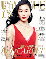
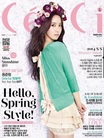
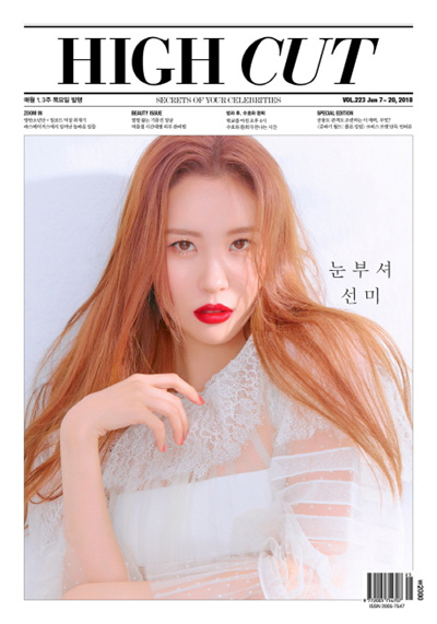
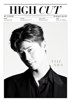
Vogue/ Ceci/ High Cut
2.
I choose High Cut because of its simplistic look with a very structured look. The minimalistic style looks very clean and the centre image pulls the focus of the magazine cover so what the main image is will determine the overall feel and attraction to the magazine. With this is mid, I can move on to think about the stance, clothing choice and hairstyle of my model in order to make it as impactful as I can.
3.
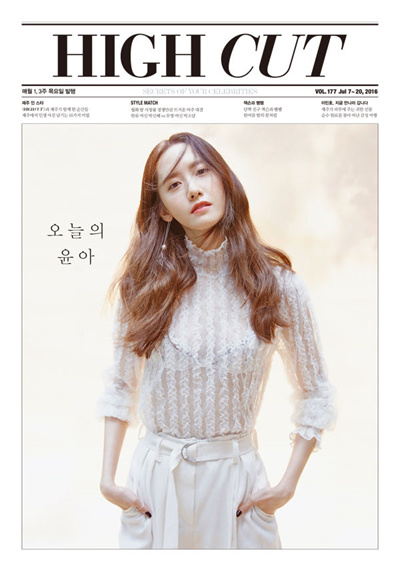
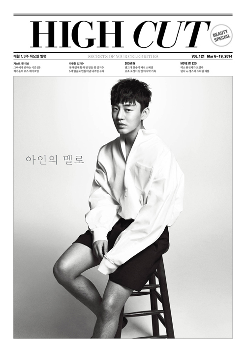
Title - The title is the second biggest aspect in the magazine cover after the main image. The font is bold and big in order to catch audience eyes and the word 'cut' is slightly slanted to make it a bit more unique than it already is.
Main image - After a few looks at the different covers of the magazine, I found that there was a split between some of the images being coloured and some of them being in black and white. On the black and white covers, there is always some sort of shadow either on the background or on the models face. On the coloured covers, the shadows are less obvious and the focus is more on the model, expression, hair ad outfit.
Strapline - There are a number of sub stories under the main title but all are written in Korean for this magazine so I am not sure what it says but most likely the headline for different stories that are inside the magazine.
Design - The overall design of the magazine is simplistic, minimalistic and clean. It doesn't look like many other well known magazines like the Vogue or Elle and the way there is no overlap between the main image and tag lines is what makes this magazine unique.

No comments:
Post a Comment